Color & Typography Themes
Slidev Theme Scholarly v2.0 introduces customizable color and typography themes to match your institution's branding or personal preferences.
Theme Gallery
Classic Blue (Default)
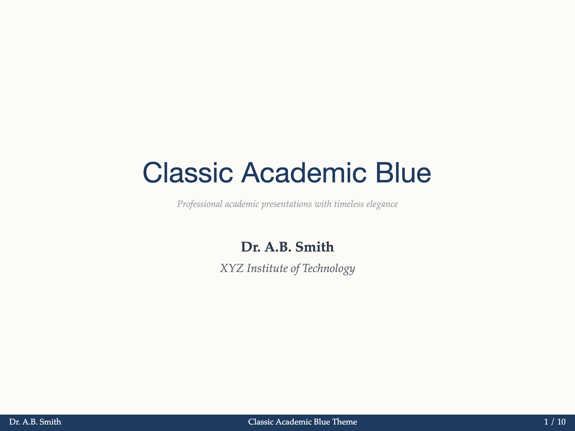

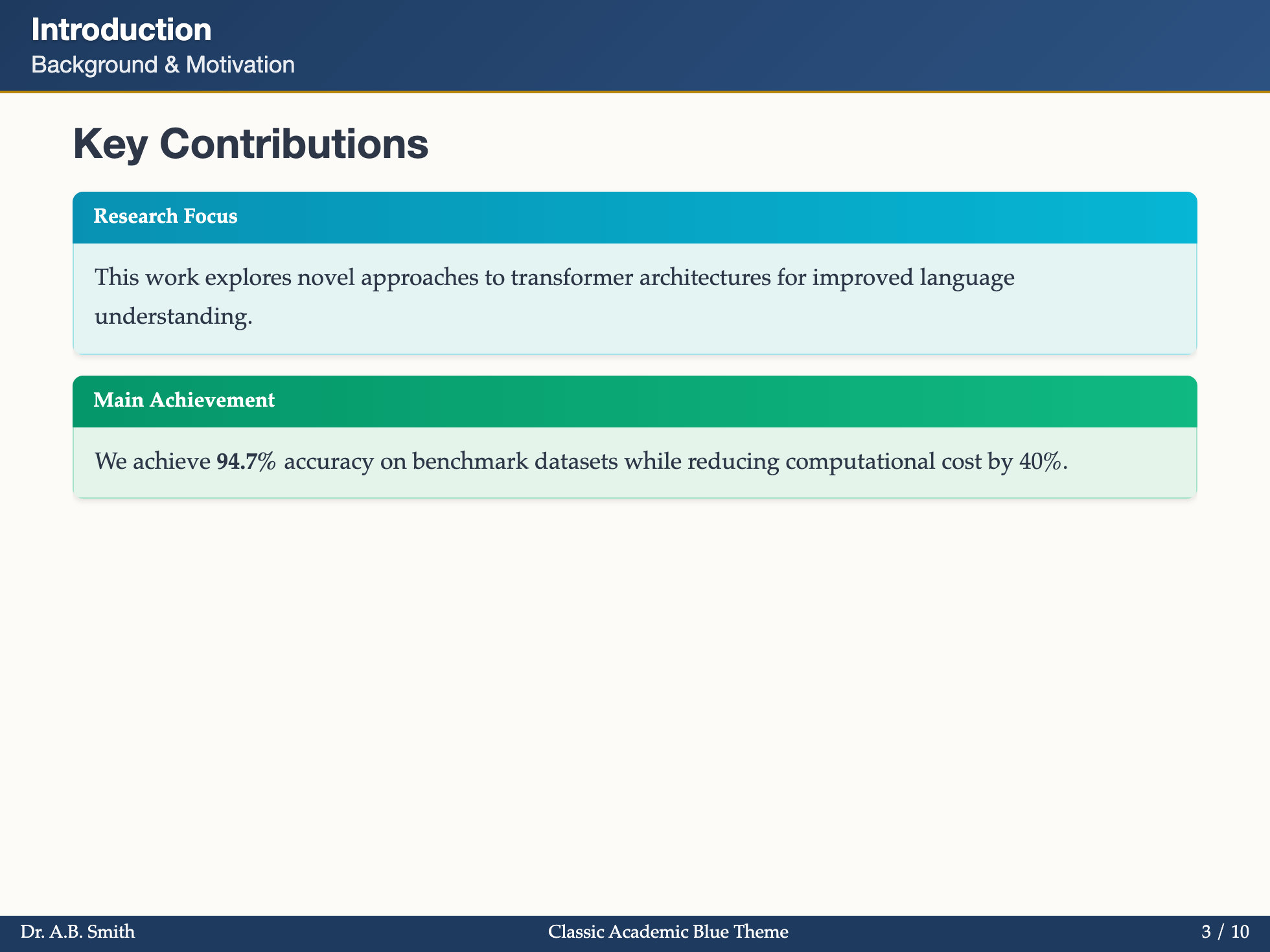
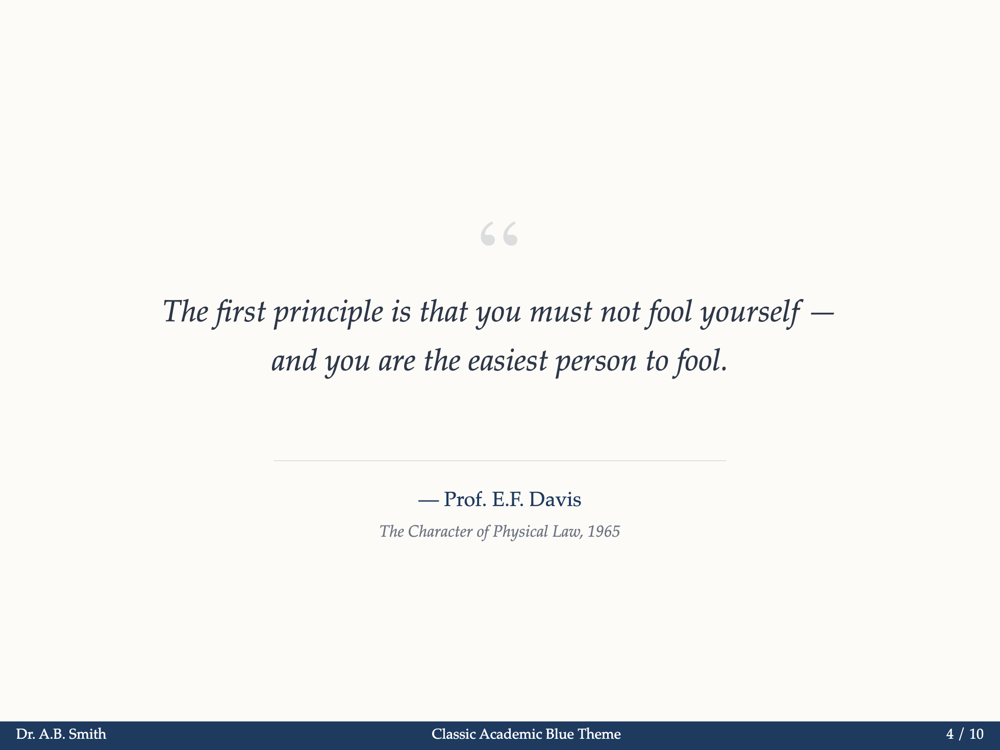
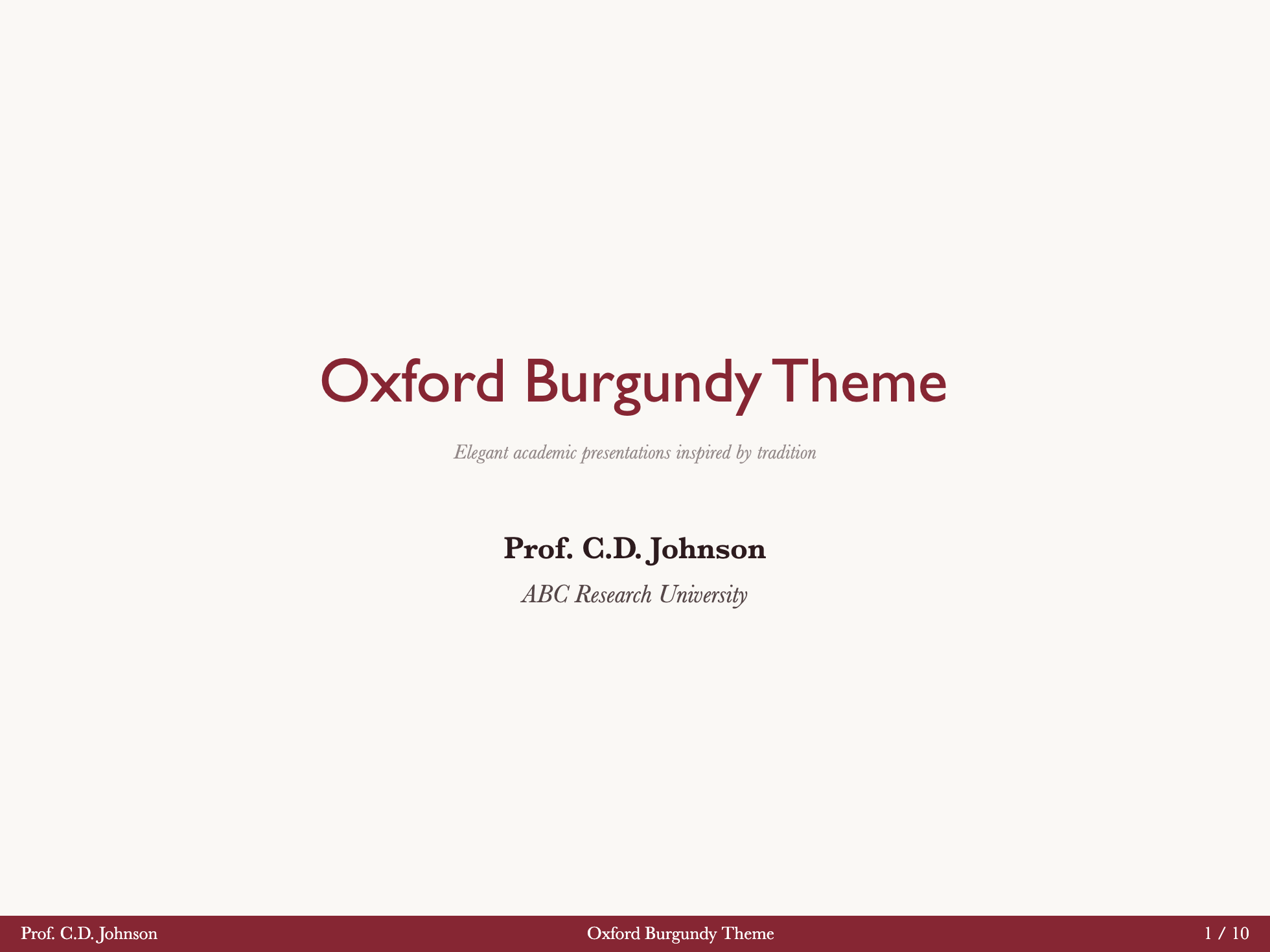
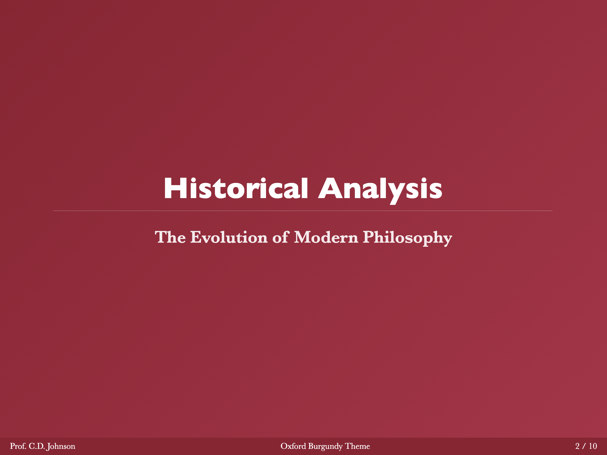
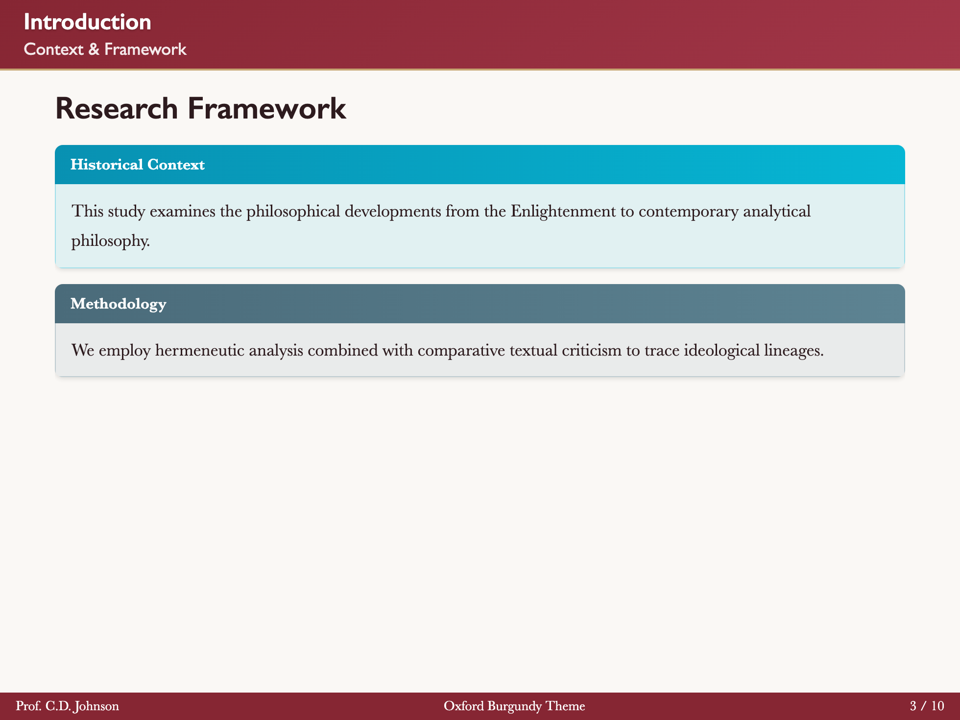
Oxford Burgundy

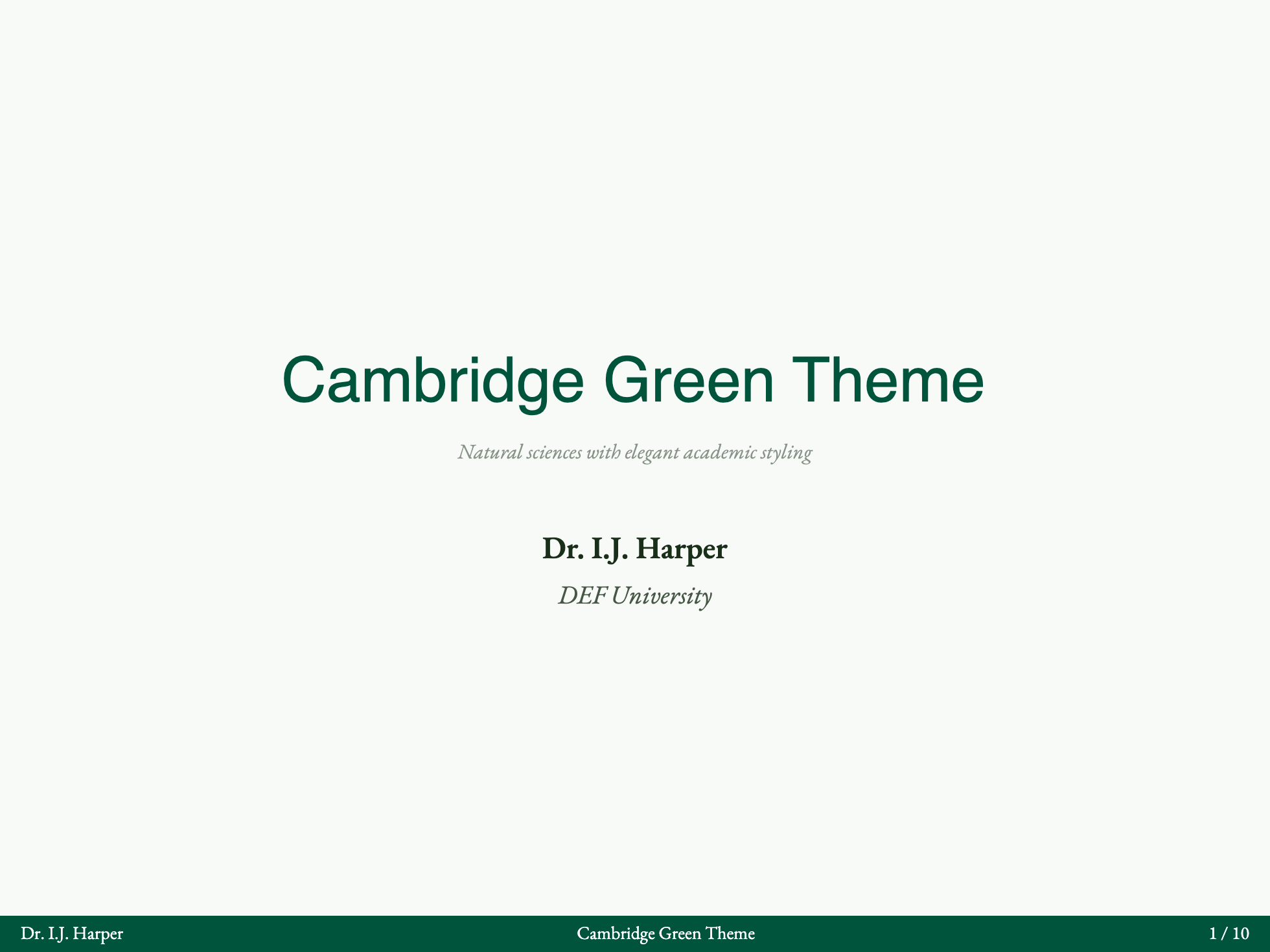
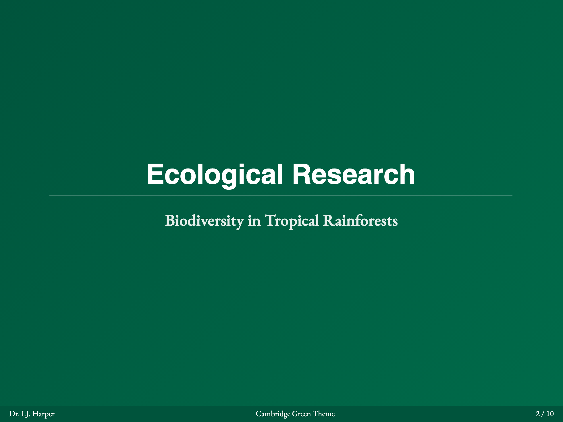
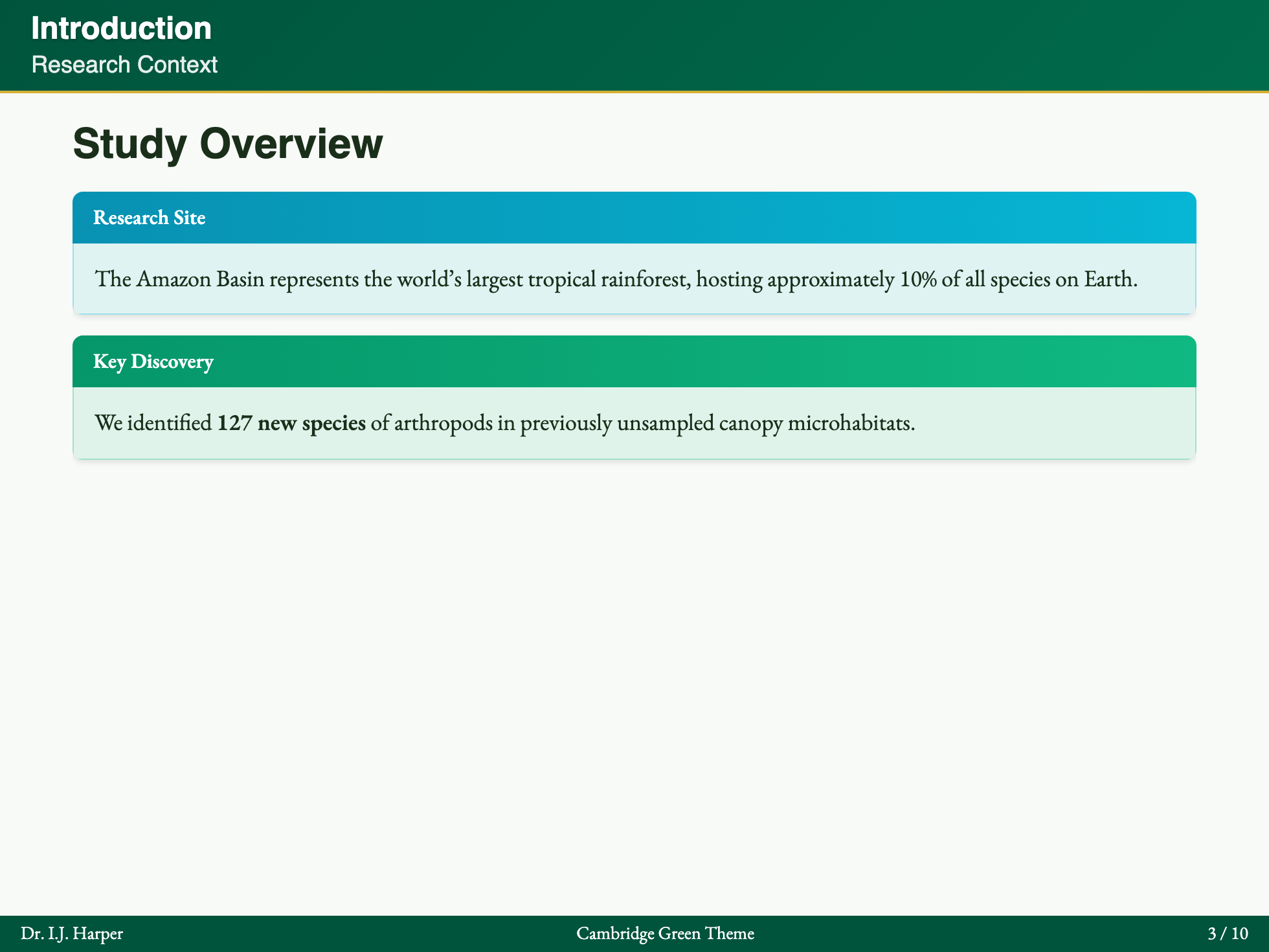
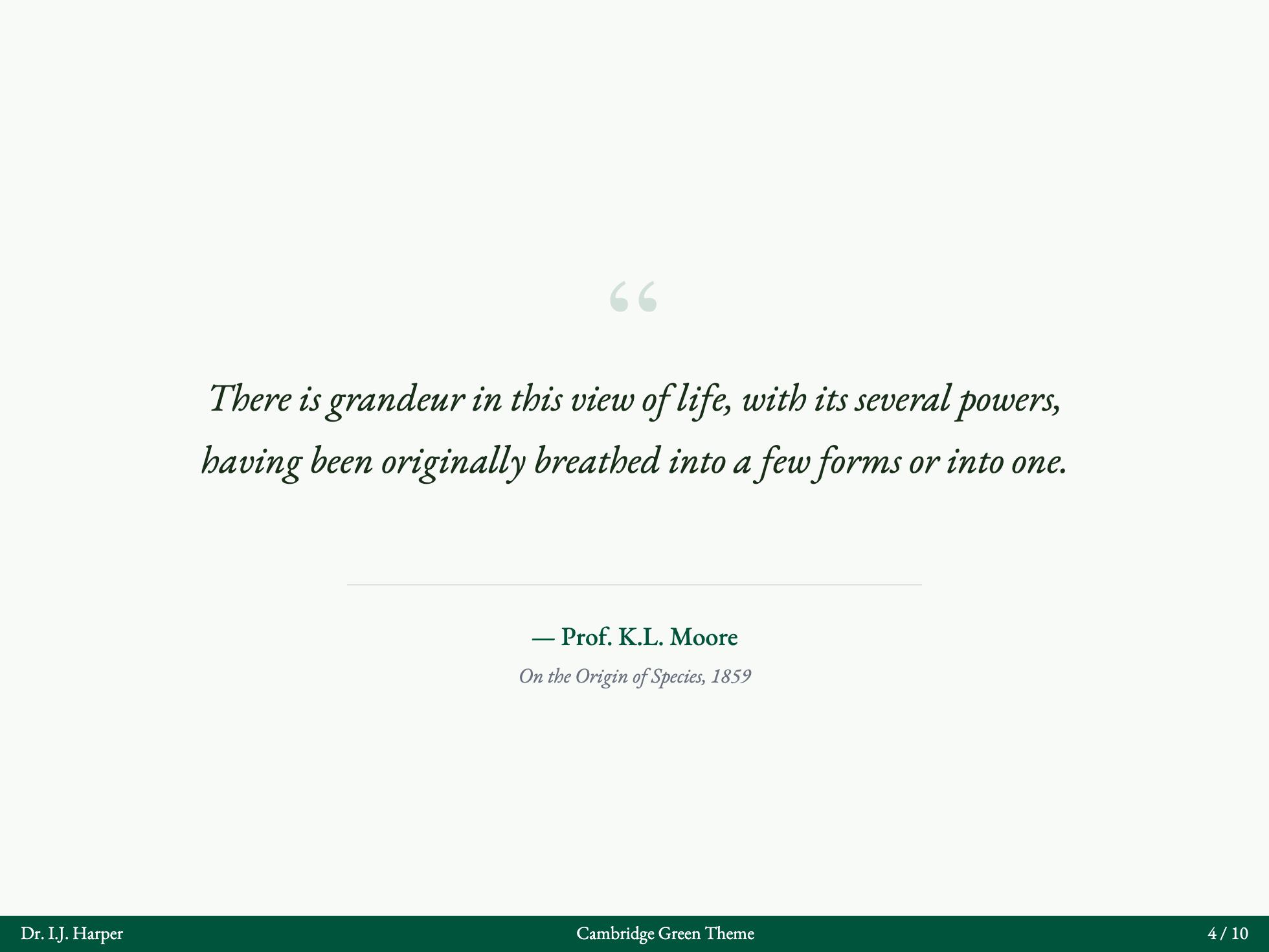
Cambridge Green
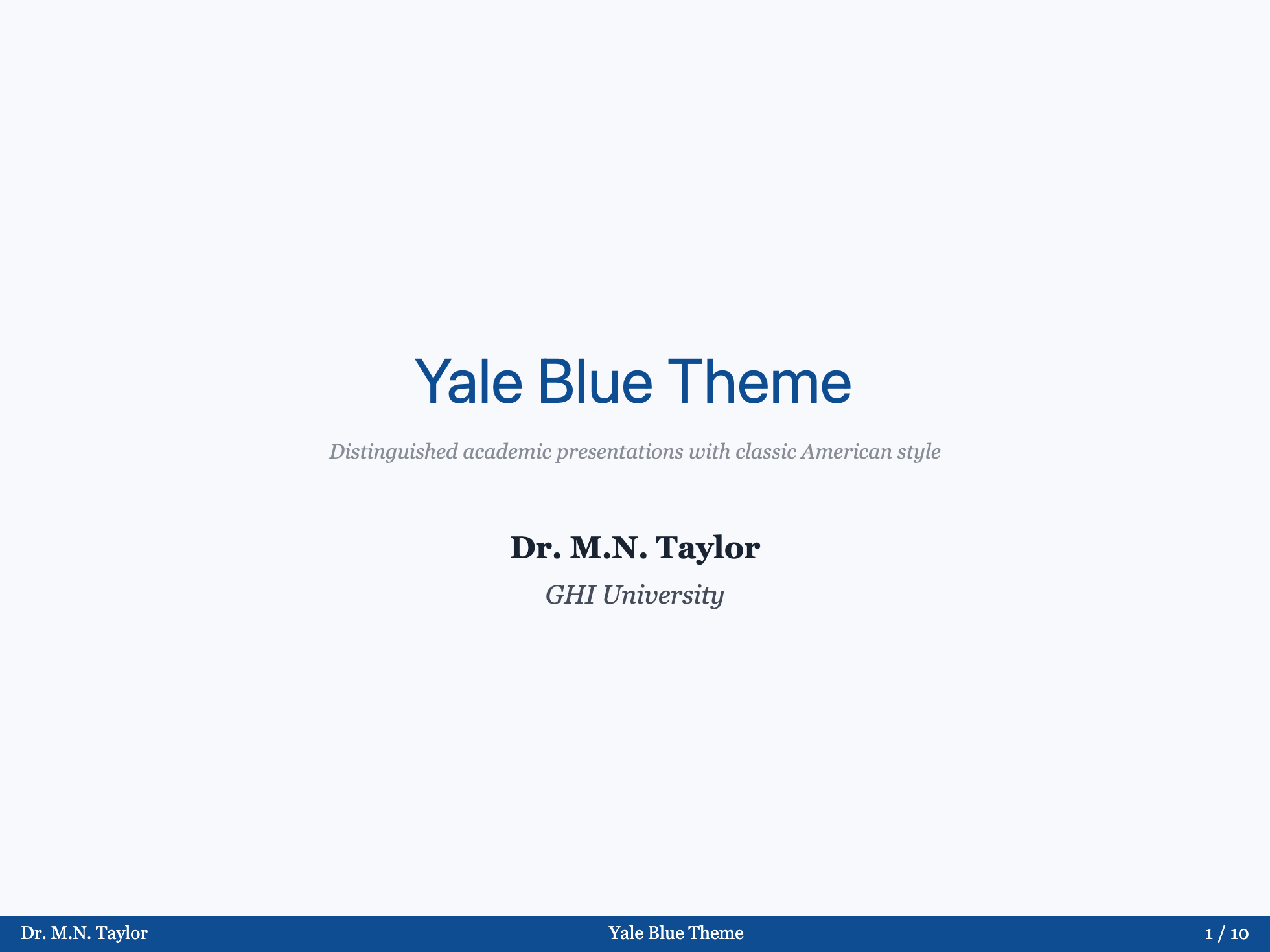
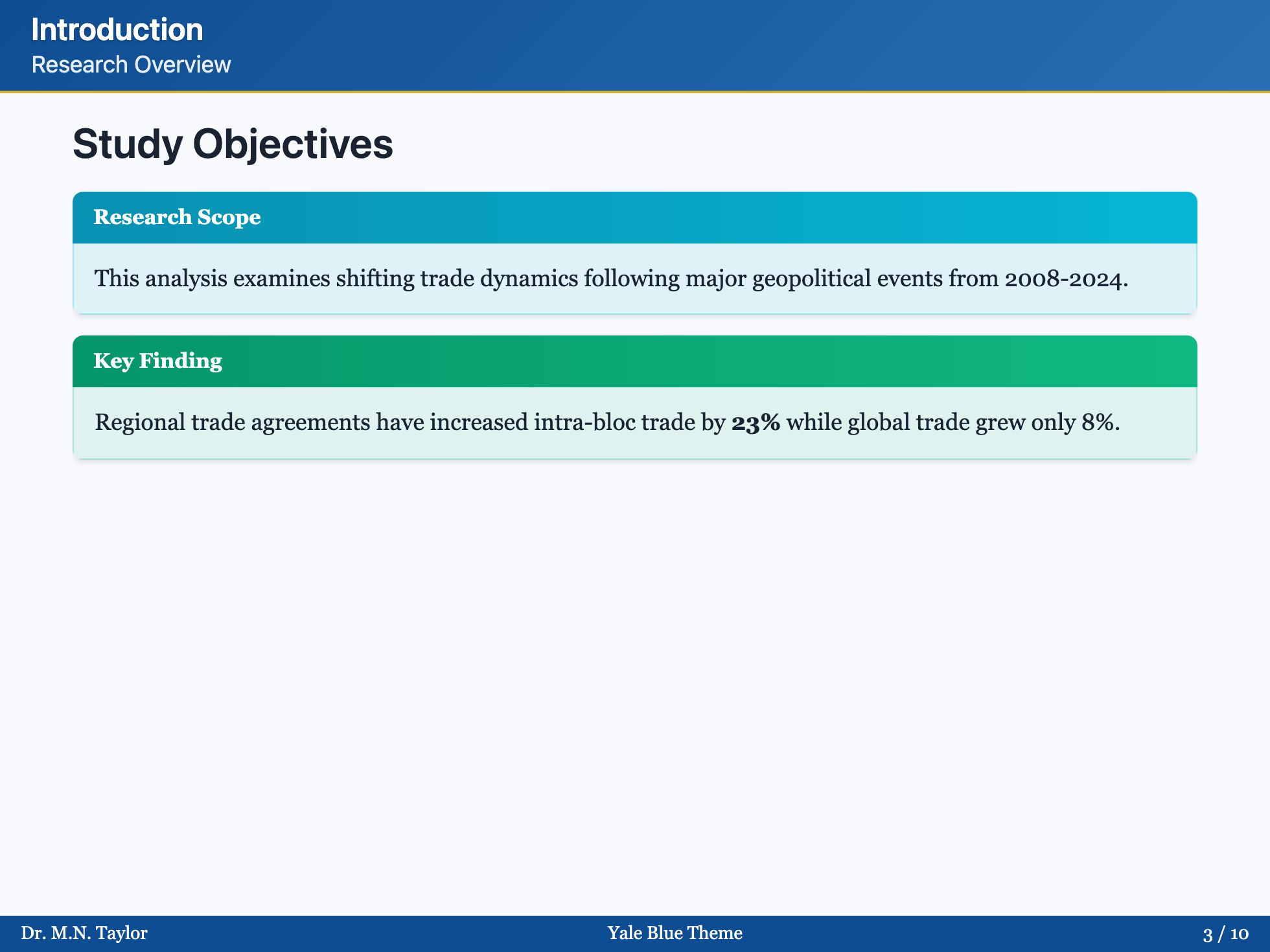
Yale Blue

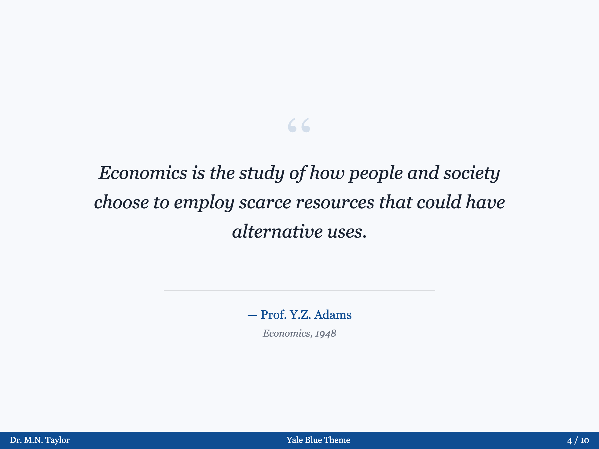
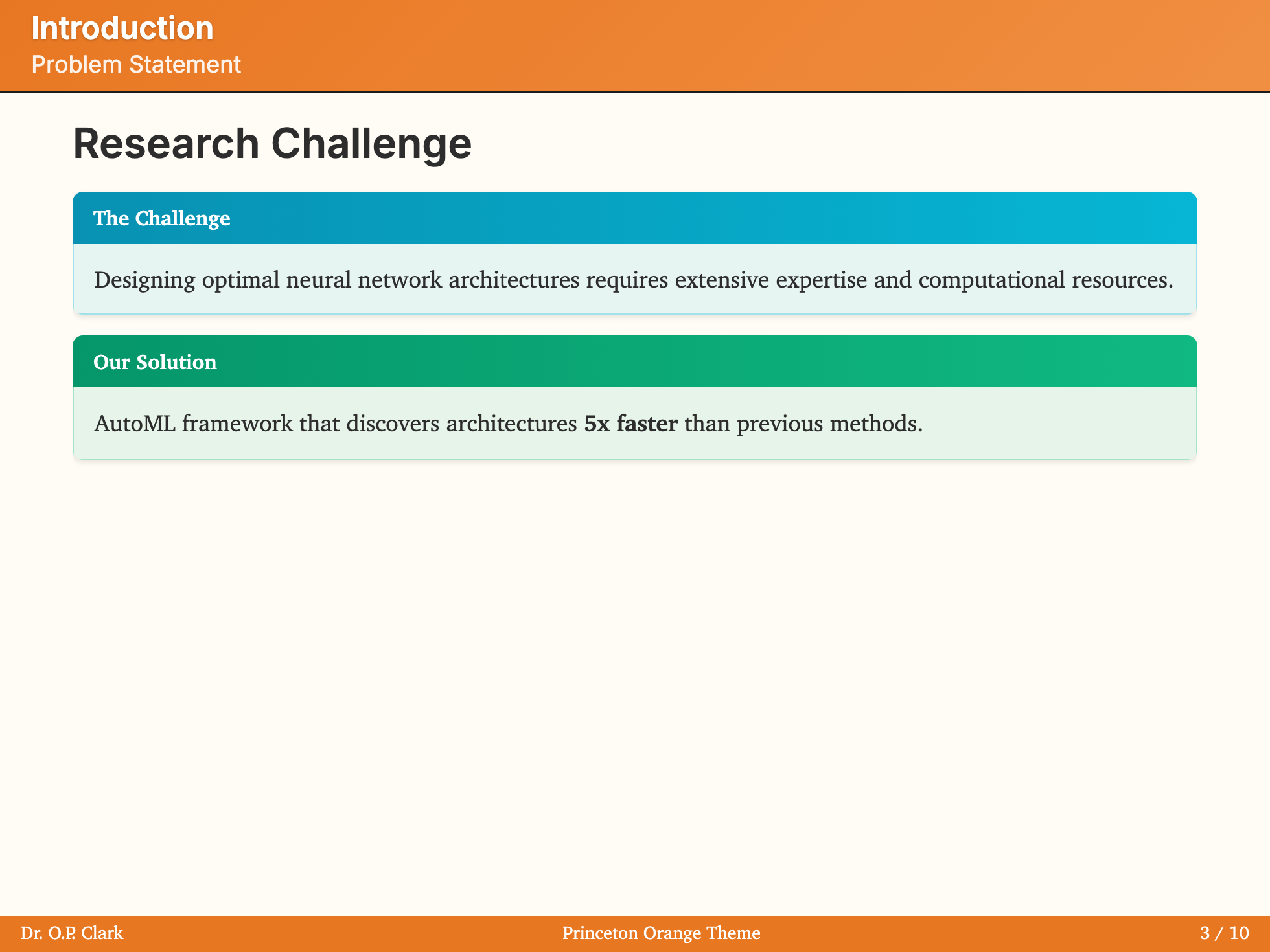
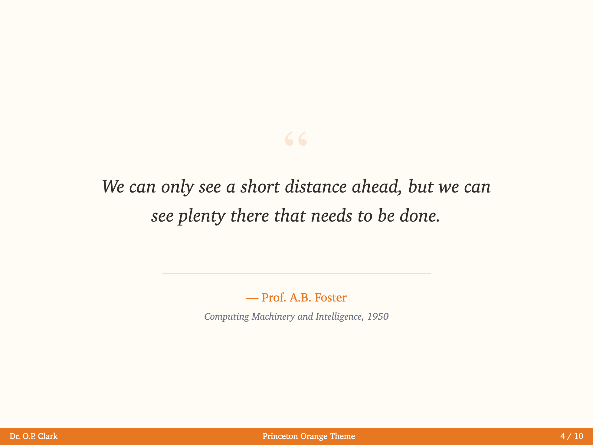
Princeton Orange


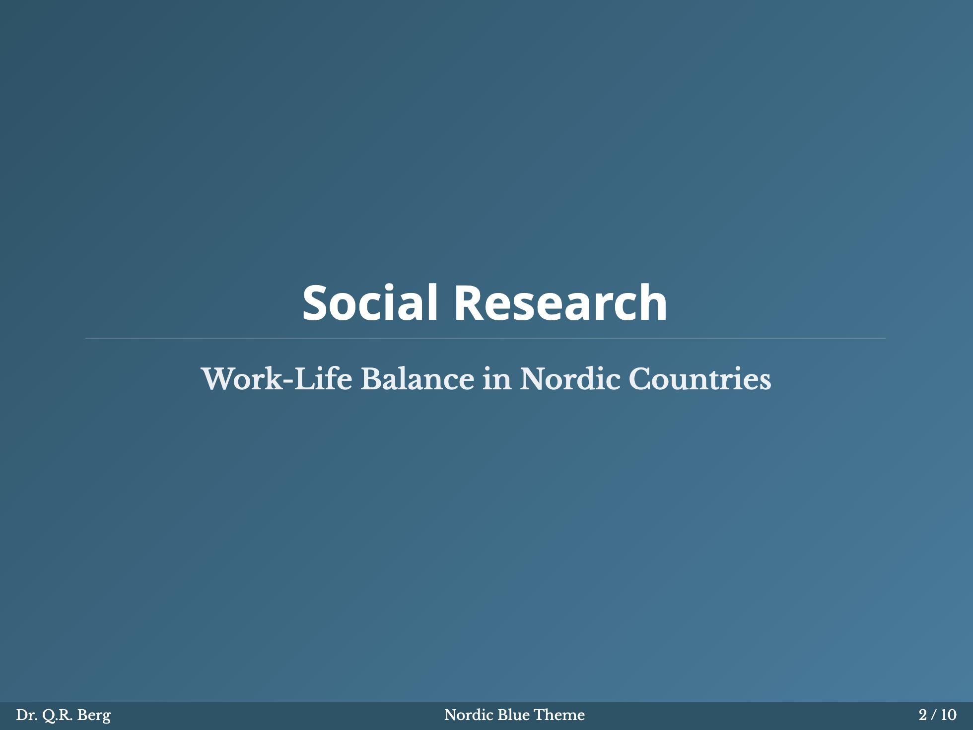
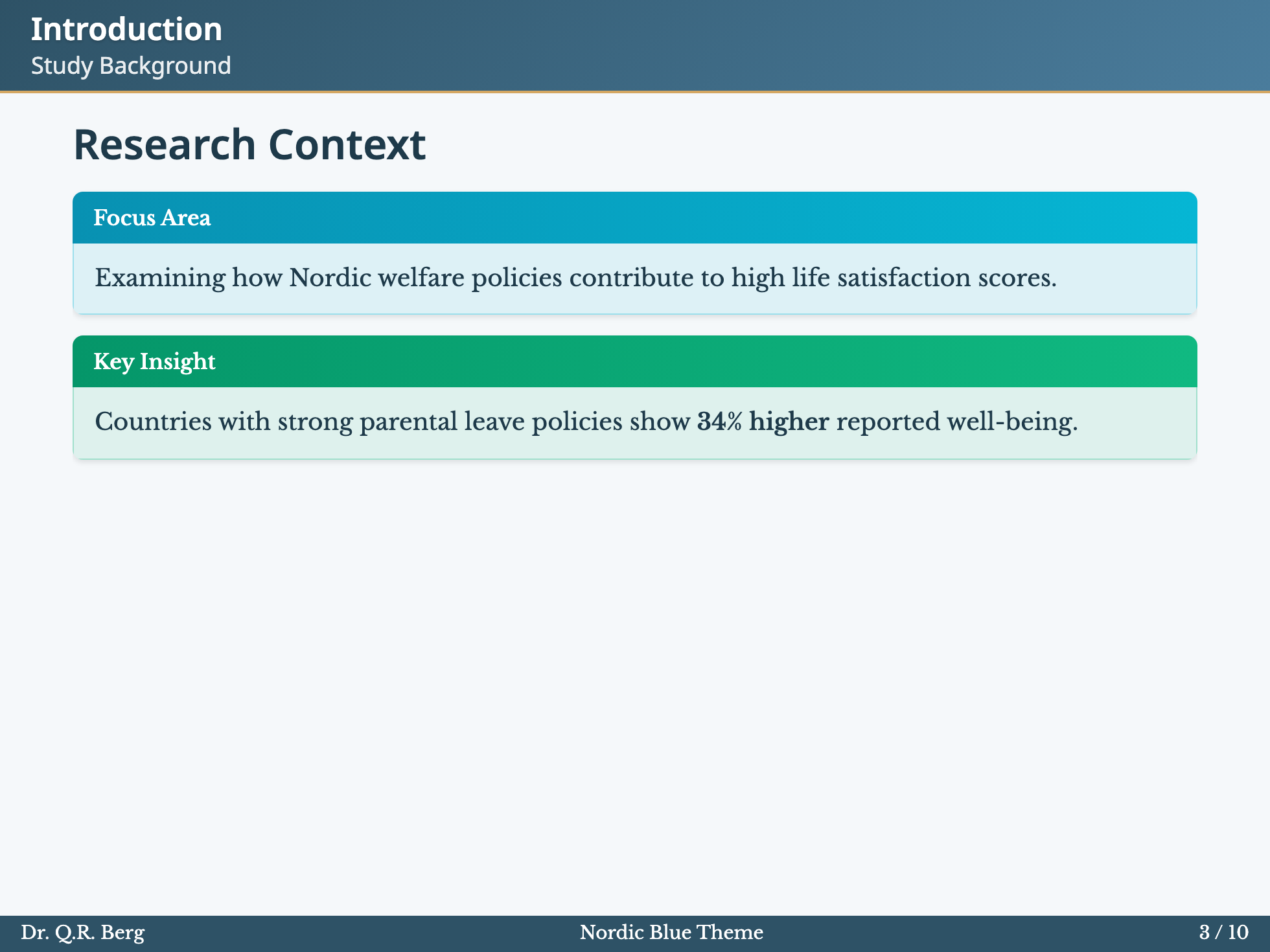
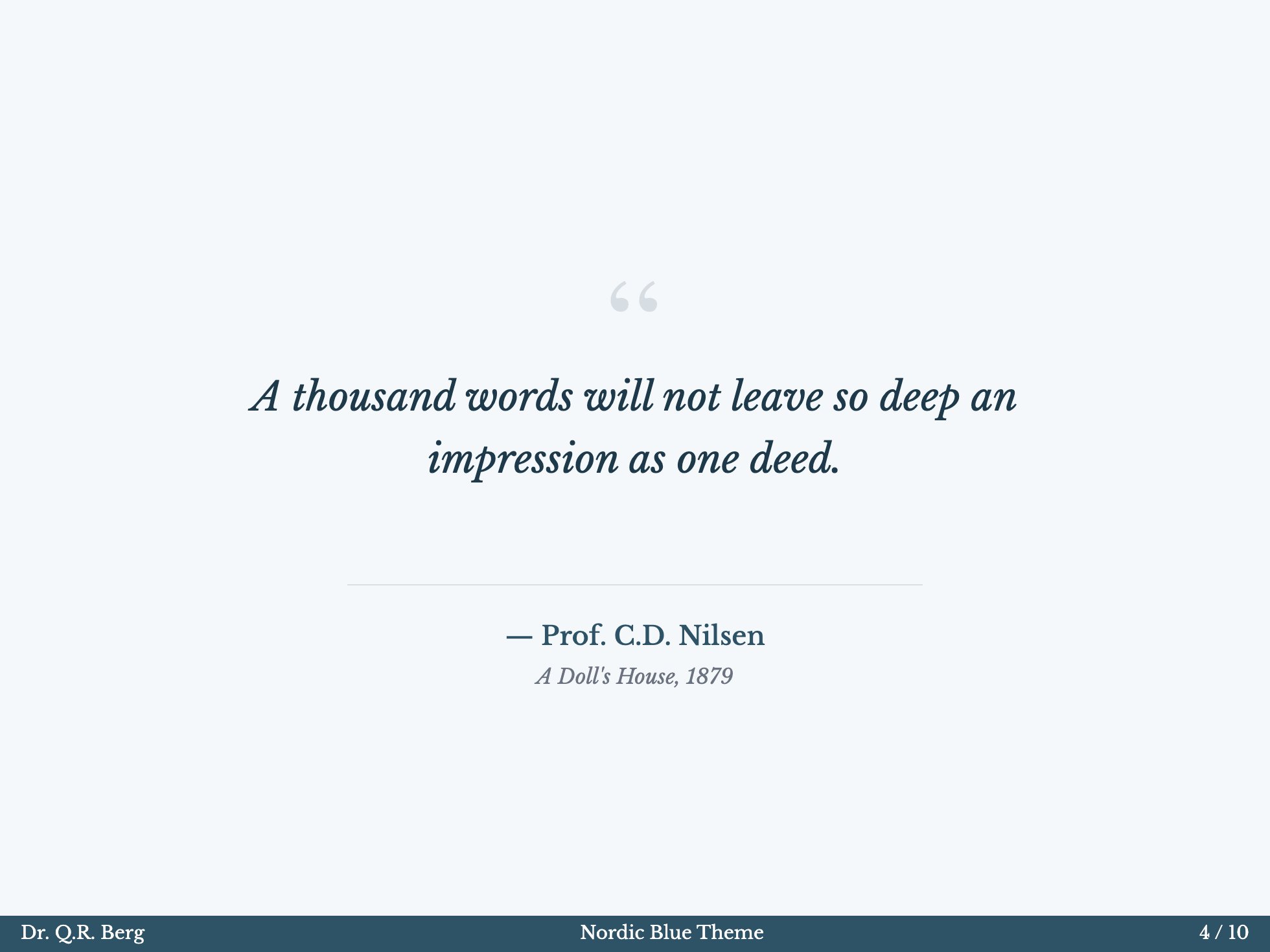
Nordic Blue
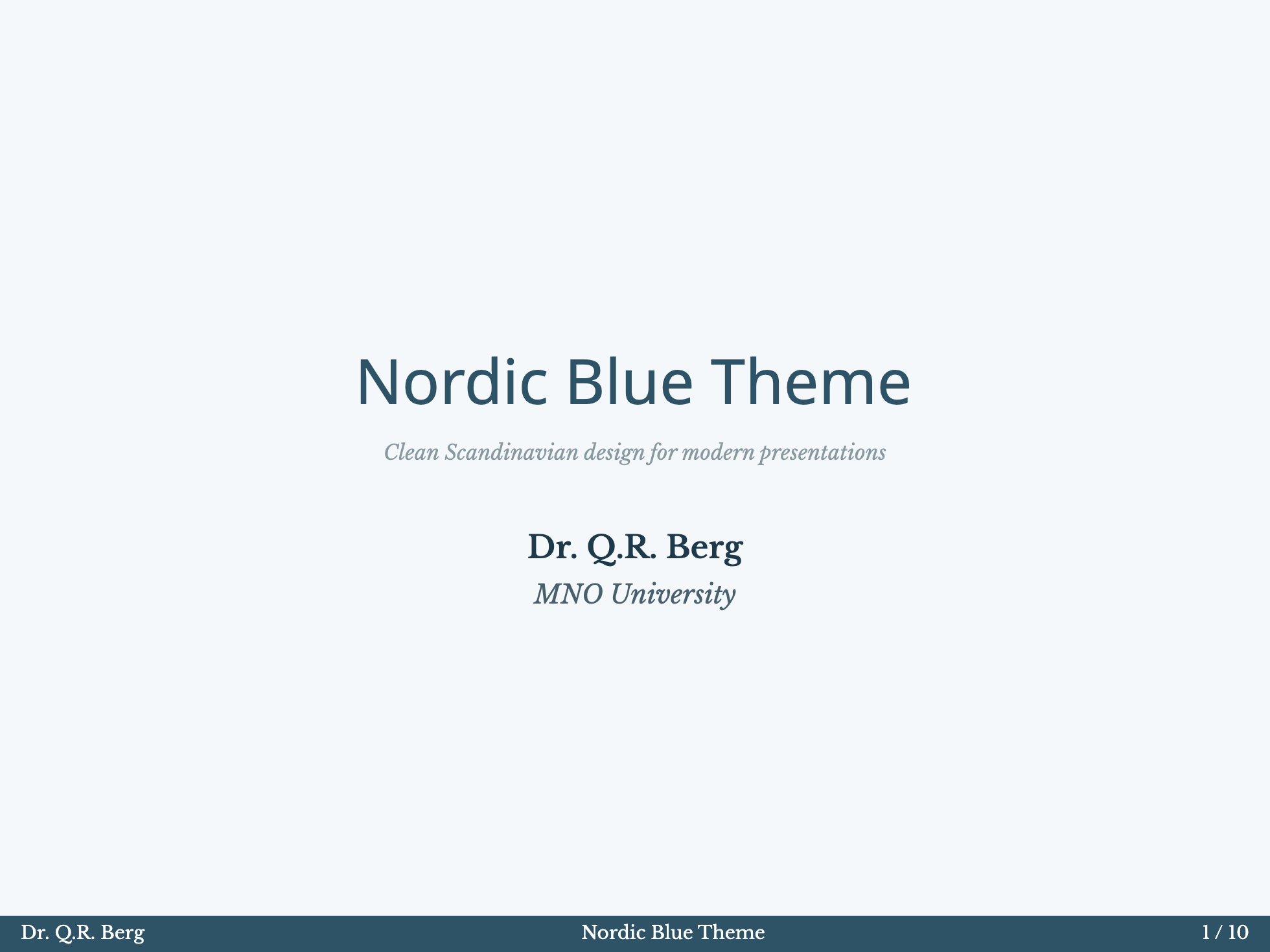
Monochrome
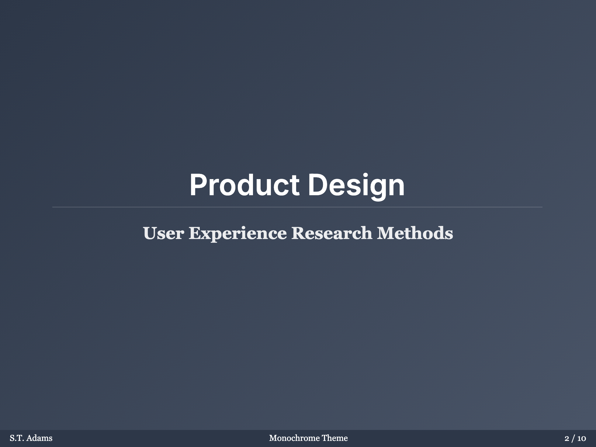
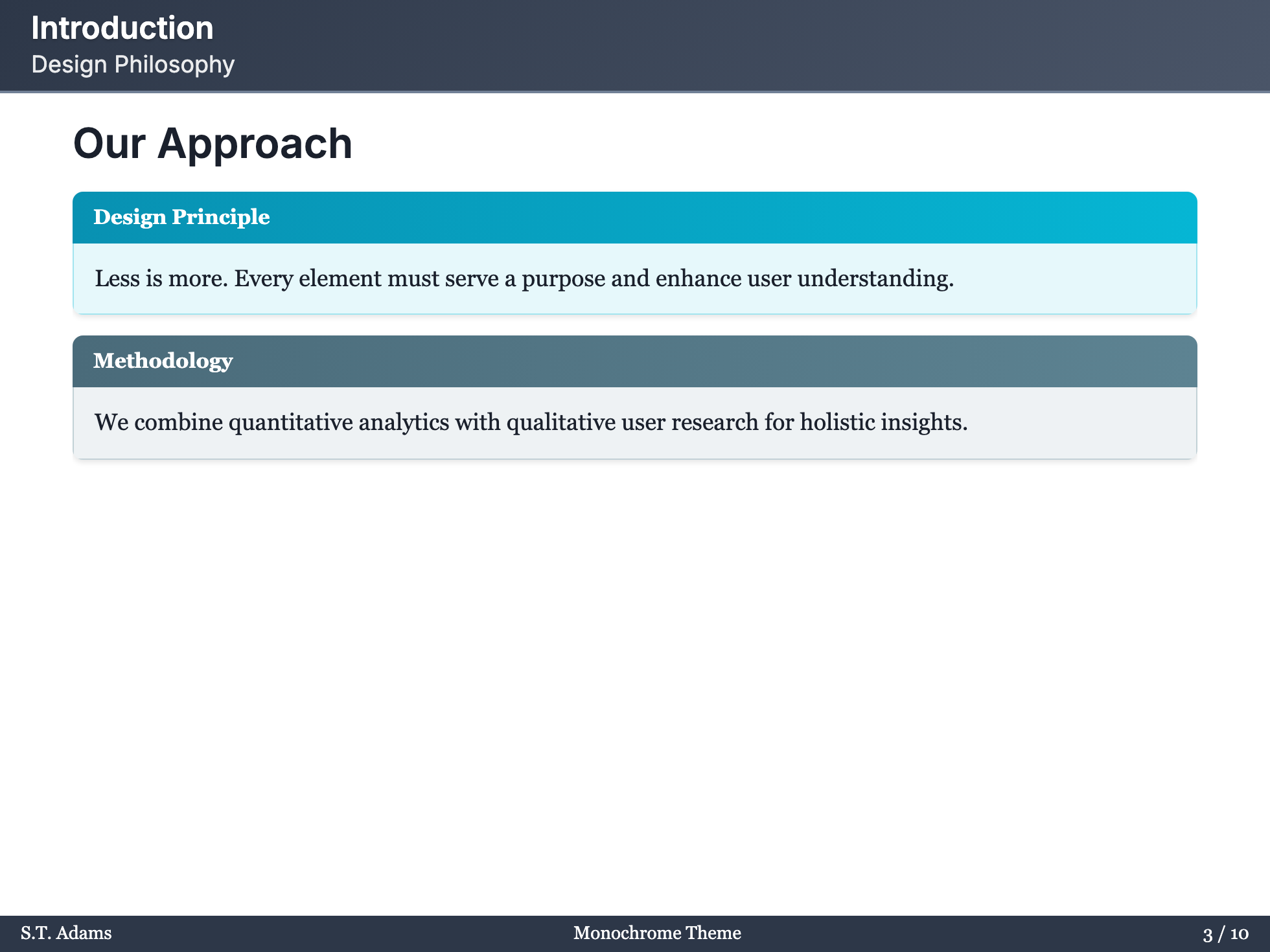
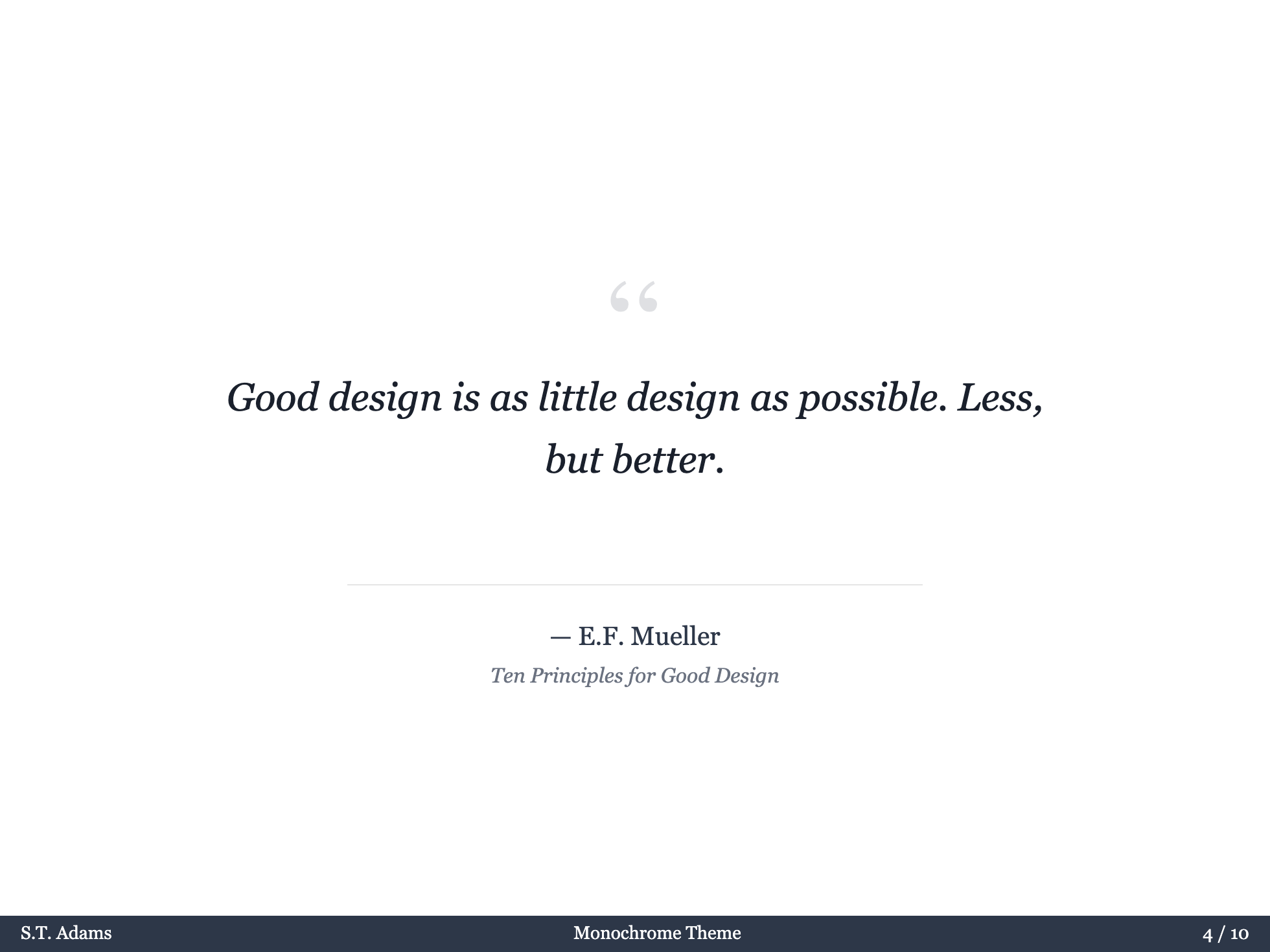
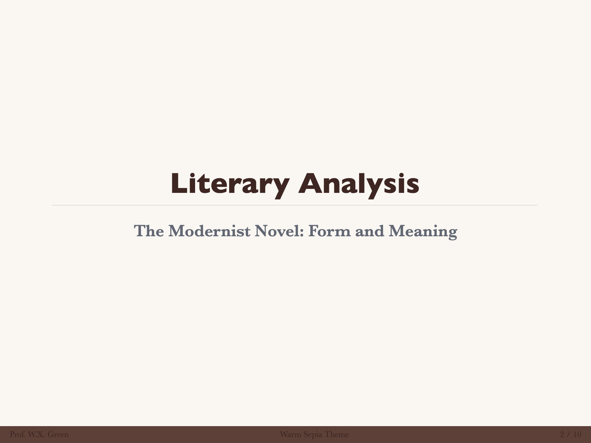
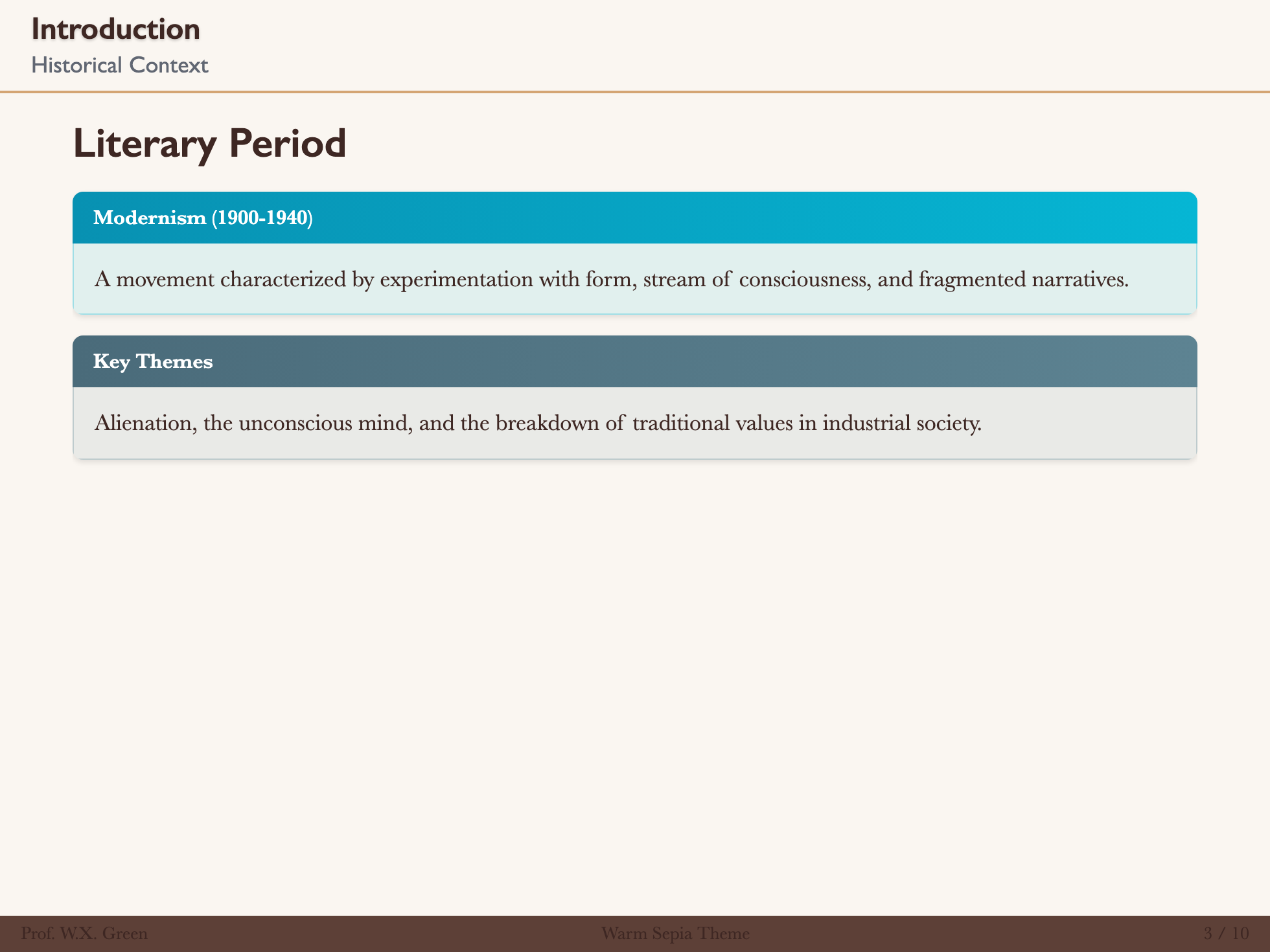
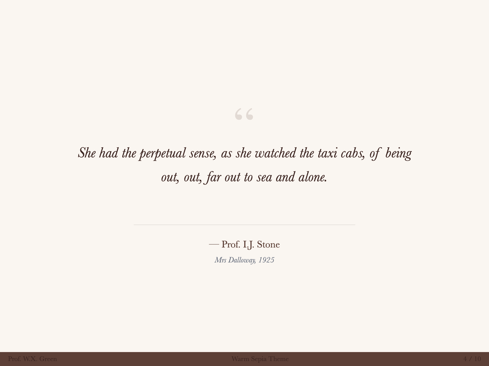
Warm Sepia
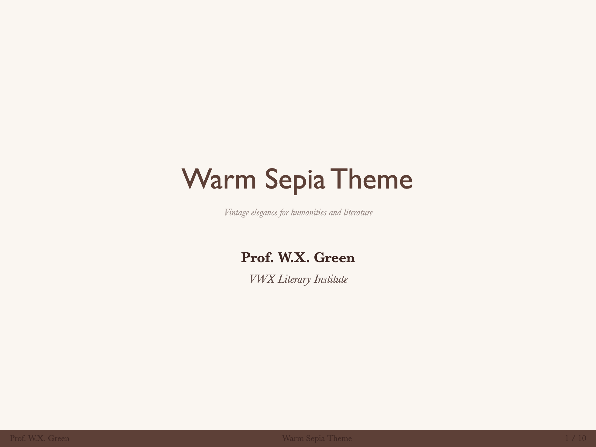
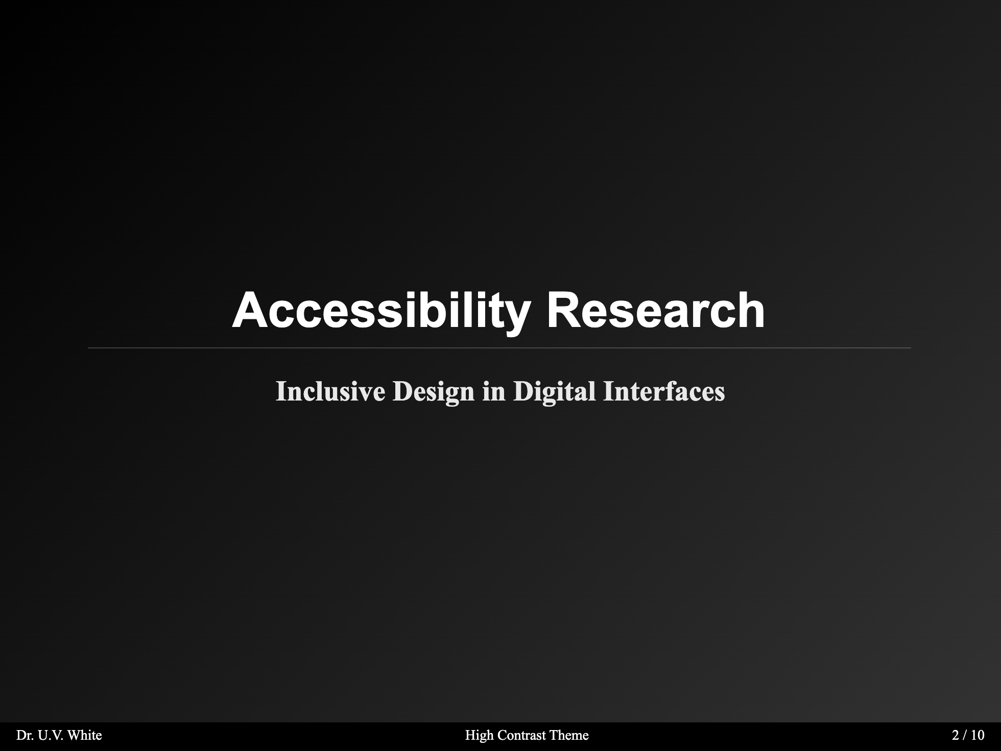
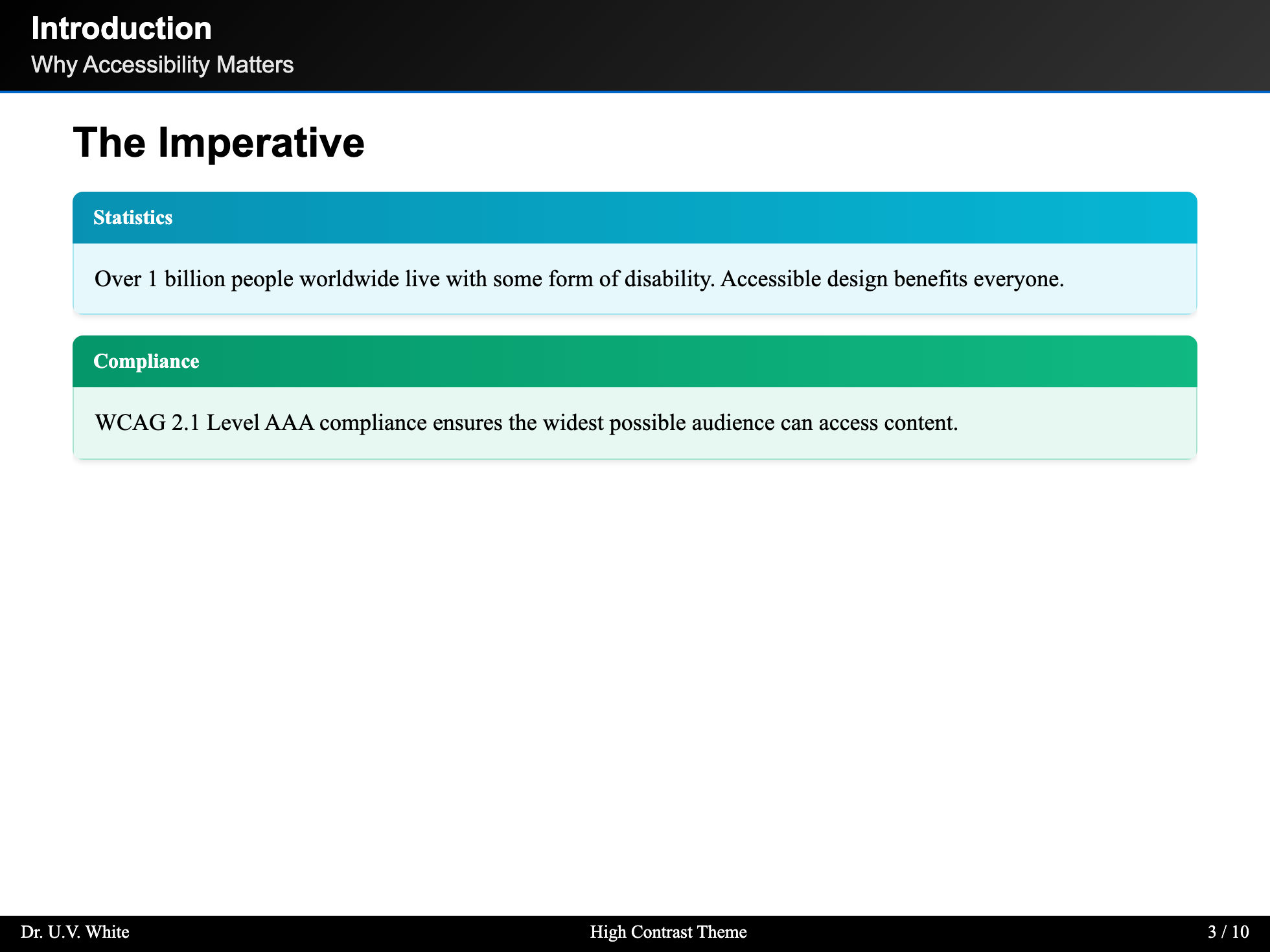
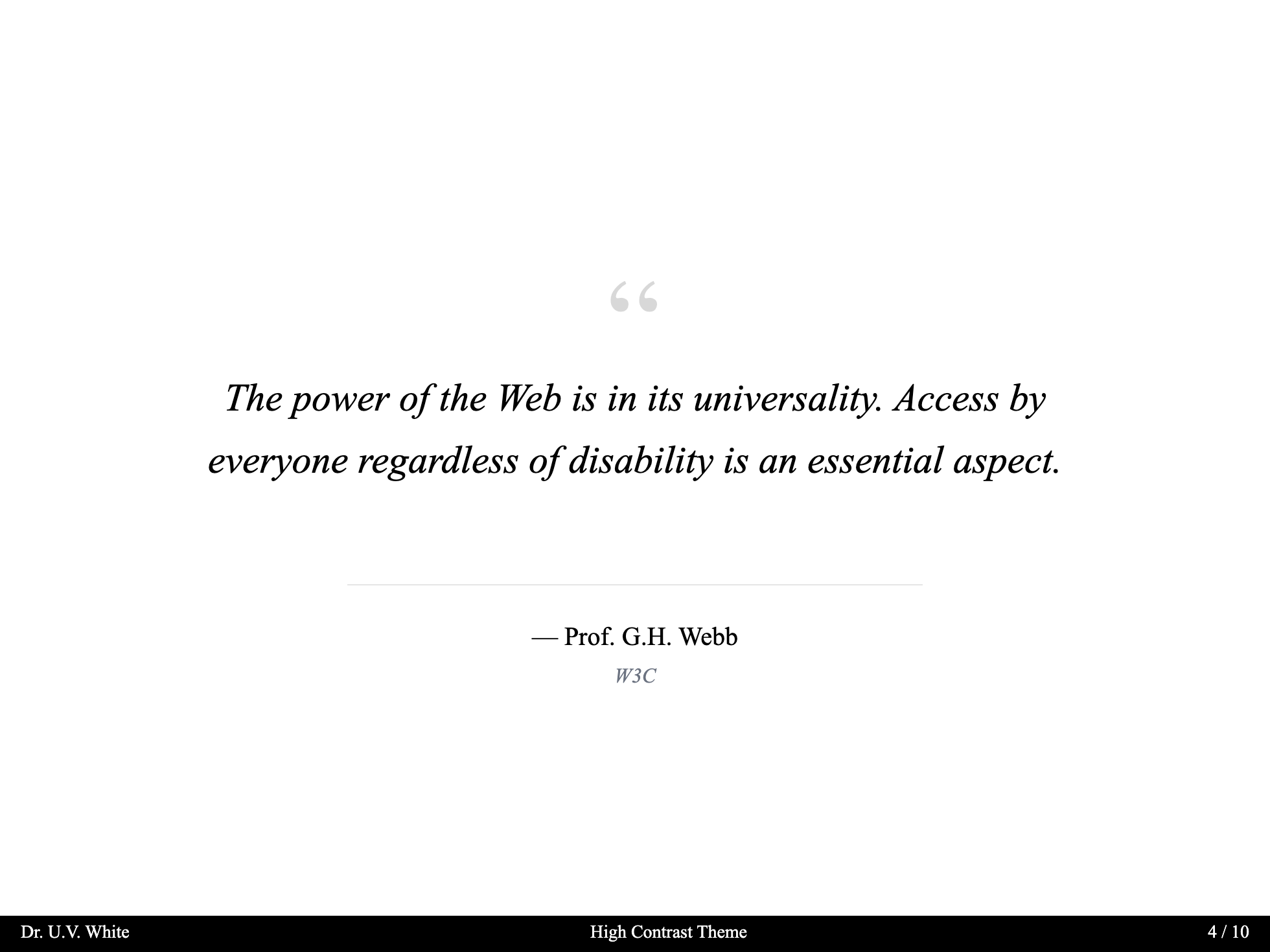
High Contrast
Color Themes
Choose from 9 professionally designed color palettes:
Classic Academic Blue (Default)
The default theme inspired by traditional academic institutions.
---
theme: scholarly
# Classic Blue is the default, no additional configuration needed
---
Colors:
- Primary:
#1e3a5f(Deep Academic Blue) - Accent:
#b8860b(Academic Gold) - Background:
#fdfbf7(Warm Ivory)
Oxford Burgundy
Rich burgundy inspired by Oxford University.
---
theme: scholarly
themeConfig:
  colorTheme: oxford-burgundy
---
Colors:
- Primary:
#862633(Oxford Burgundy) - Accent:
#c5a572(Antique Gold) - Background:
#faf8f5(Off-white)
Cambridge Green
Classic green reminiscent of Cambridge University.
---
theme: scholarly
themeConfig:
  colorTheme: cambridge-green
---
Colors:
- Primary:
#00543c(Cambridge Green) - Accent:
#d4af37(Gold)
Yale Blue
Traditional Yale blue for a distinguished look.
---
theme: scholarly
themeConfig:
  colorTheme: yale-blue
---
Colors:
- Primary:
#0f4d92(Yale Blue) - Accent:
#d4af37(Gold)
Princeton Orange
Vibrant orange for energetic presentations.
---
theme: scholarly
themeConfig:
  colorTheme: princeton-orange
---
Colors:
- Primary:
#e87722(Princeton Orange) - Accent:
#1c1c1c(Black)
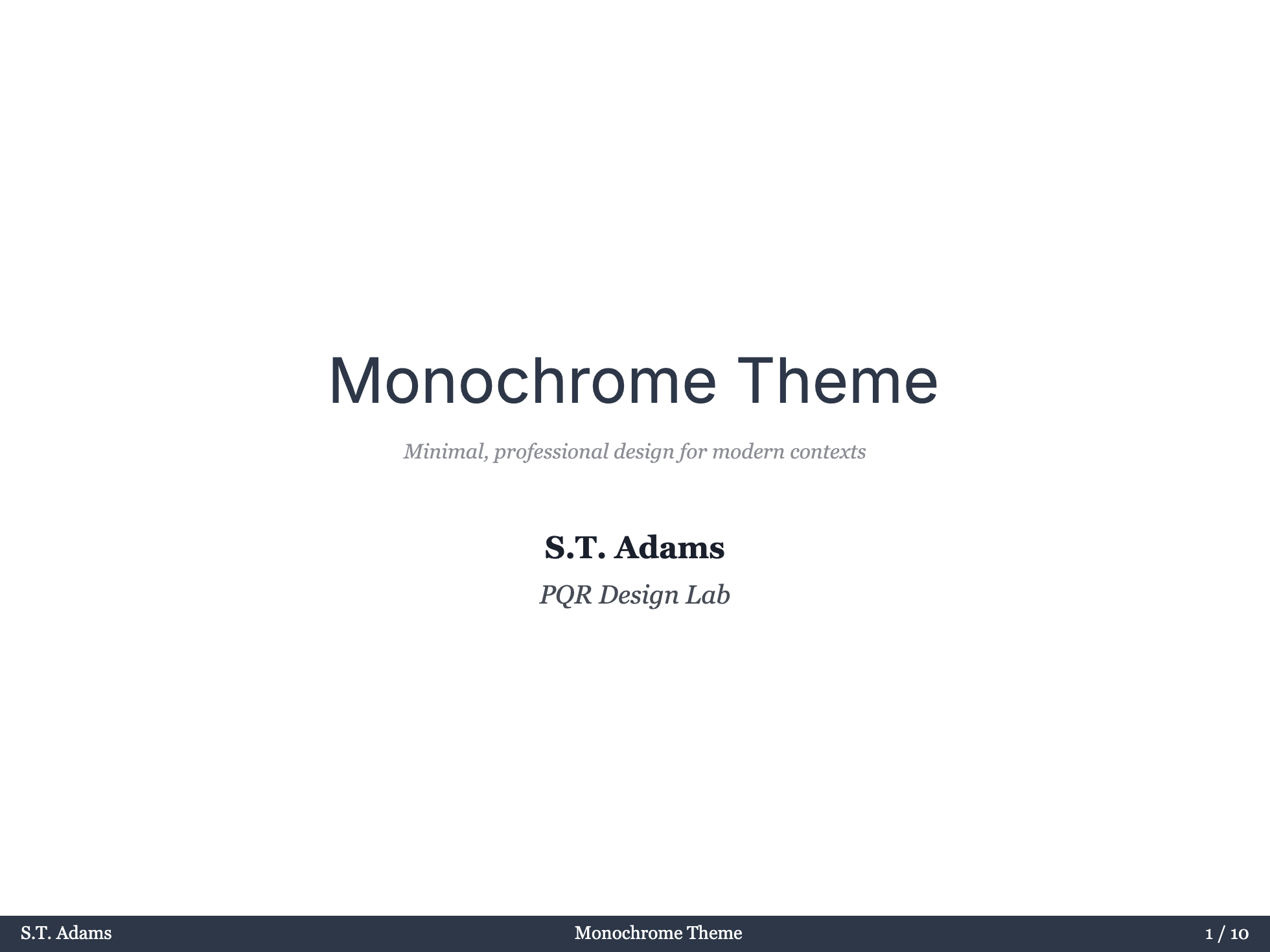
Monochrome Professional
Clean, professional grayscale theme.
---
theme: scholarly
themeConfig:
  colorTheme: monochrome
---
Warm Sepia
Warm, vintage-inspired sepia tones.
---
theme: scholarly
themeConfig:
  colorTheme: warm-sepia
---
Nordic Blue
Cool, Scandinavian-inspired blue palette.
---
theme: scholarly
themeConfig:
  colorTheme: nordic-blue
---
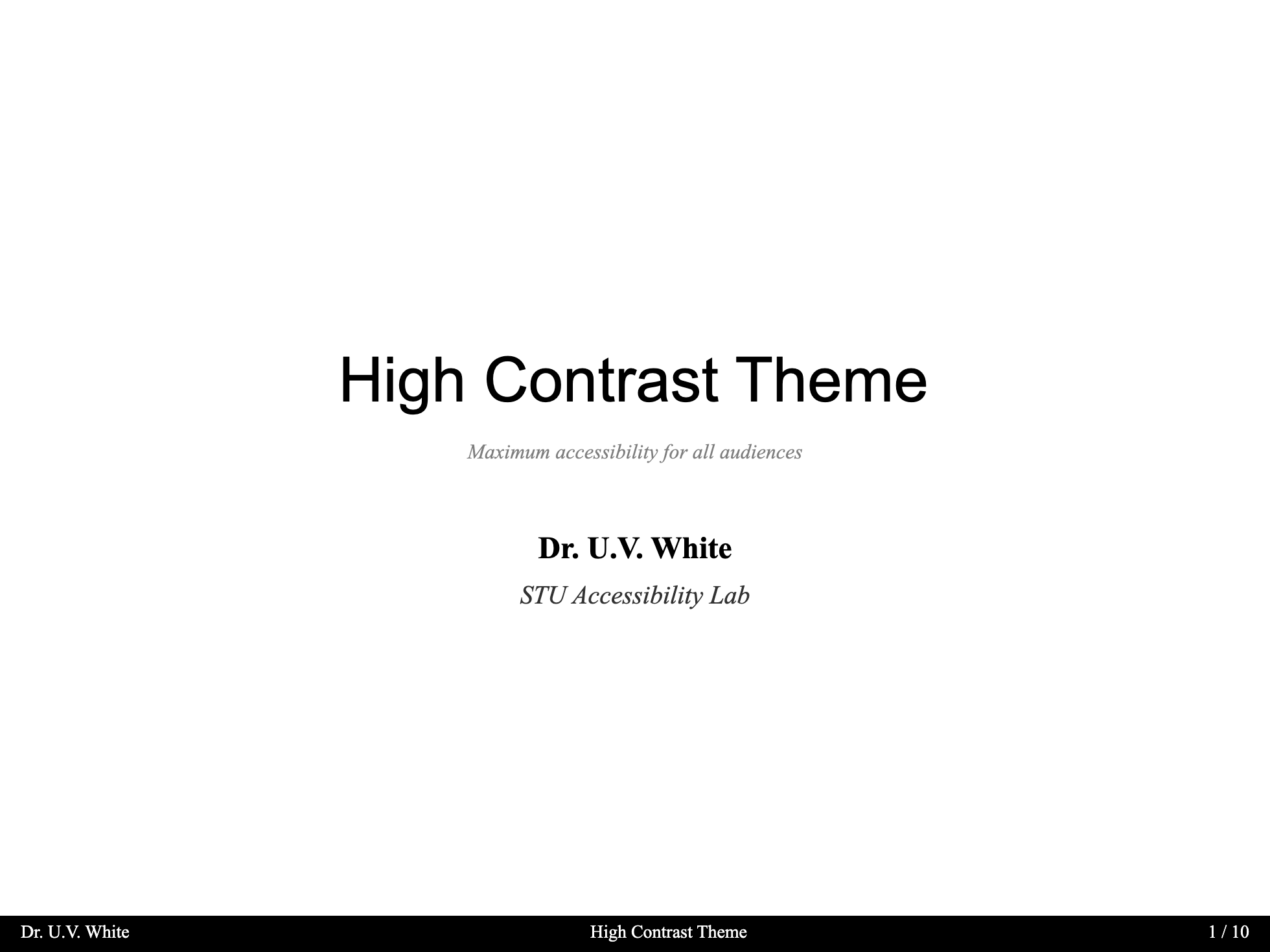
High Contrast (Accessibility)
Maximum contrast theme for accessibility needs. WCAG AAA compliant.
---
theme: scholarly
themeConfig:
  colorTheme: high-contrast
---
Colors:
- Primary:
#000000(Black) - Accent:
#0066cc(Blue) - Background:
#ffffff(White)
Typography Themes
Choose from 8 carefully curated font combinations:
Classic Palatino (Default)
Traditional academic typography with Palatino serif and Helvetica sans.
---
theme: scholarly
# Classic is the default
---
Fonts:
- Serif: Palatino Linotype, Book Antiqua, Palatino
- Sans: Helvetica Neue, Helvetica, Arial
Modern Academica
Contemporary academic styling with Georgia and Source Sans Pro.
---
theme: scholarly
themeConfig:
  fontTheme: modern
---
Fonts:
- Serif: Georgia, Cambria
- Sans: Source Sans Pro, Segoe UI, Roboto
Traditional Garamond
Classic book typography with Garamond.
---
theme: scholarly
themeConfig:
  fontTheme: traditional
---
Fonts:
- Serif: Garamond, Baskerville
- Sans: Gill Sans, Optima, Helvetica
Contemporary Sans
Clean, modern sans-serif focused design.
---
theme: scholarly
themeConfig:
  fontTheme: contemporary
---
Fonts:
- Serif: Charter, Georgia, Cambria
- Sans: Inter, SF Pro Display, Segoe UI
Humanist
Warm, readable humanist typefaces.
---
theme: scholarly
themeConfig:
  fontTheme: humanist
---
Fonts:
- Serif: Crimson Text, Libre Baskerville, Georgia
- Sans: Open Sans, Noto Sans
Technical
LaTeX-inspired technical typography.
---
theme: scholarly
themeConfig:
  fontTheme: technical
---
Fonts:
- Serif: Computer Modern, Latin Modern
- Sans: IBM Plex Sans, Roboto
Elegant Serif
Refined, elegant serif typography.
---
theme: scholarly
themeConfig:
  fontTheme: elegant
---
Fonts:
- Serif: Cormorant Garamond, EB Garamond
- Sans: Montserrat, Lato
Sans Default
Sans-serif focused typography for modern presentations.
---
theme: scholarly
themeConfig:
  fontTheme: sans-default
---
Fonts:
- Sans: Inter, SF Pro Display, system-ui
- Serif: Georgia, Cambria (for fallback)
Combining Themes
You can combine color and typography themes:
---
theme: scholarly
themeConfig:
  colorTheme: oxford-burgundy
  fontTheme: traditional
  contentMode: light # Ordinary slide and readable content surfaces
  chromeMode: dark   # Header, footer, TOC, and toolbar surfaces
  sectionMode: dark  # Section slide appearance
---
Surface Modes
Control readable slide surfaces, player chrome, and section dividers separately:
| Option | Controls | Values |
|---|---|---|
contentMode | Ordinary slide canvas, quote, code, table, footnotes, Highlight, Block, and Theorem | light, dark |
chromeMode | Header, footer, page number, navigation buttons, TOC, and toolbar surfaces | light, dark, match, inverse |
sectionMode | Default section slide appearance | light, dark, match, inverse |
Legacy colorMode remains a deprecated alias for contentMode. When contentMode is omitted, Scholarly first checks colorMode, then follows Slidev's current light/dark state. For compatibility, legacy colorMode also drives chromeMode when neither contentMode nor chromeMode is set.
Migration Examples
# Before
themeConfig:
  colorTheme: classic-blue
  colorMode: dark
  sectionMode: dark

# After
themeConfig:
  colorTheme: classic-blue
  contentMode: light
  chromeMode: dark
sectionMode: dark# All-light deck
themeConfig:
colorTheme: high-contrast
contentMode: light
chromeMode: match
sectionMode: match# All-dark deck
themeConfig:
colorTheme: nordic-blue
contentMode: dark
chromeMode: match
sectionMode: matchGlobal Defaults
Set it in headmatter:
---
theme: scholarly
themeConfig:
  contentMode: light
  chromeMode: dark
  sectionMode: dark
---
Priority Chain
contentMode > legacy colorMode > Slidev light/dark state
chromeMode > legacy colorMode when contentMode is absent > 'dark'
sectionMode > 'dark'| Value | Description |
|---|---|
light | Light surfaces with dark text |
dark | Dark surfaces with light text |
match | Follow contentMode |
inverse | Invert contentMode; available for chromeMode and sectionMode |
Section Mode
Control the appearance of section layout slides independently:
Global Default
Set a default for all section slides in your headmatter:
---
theme: scholarly
themeConfig:
  sectionMode: inverse  # light, dark, match, or inverse
---
Per-Slide Override
Override the global setting on individual section slides:
---
layout: section
sectionMode: dark  # light, dark, match, or inverse
---

# This Section Uses Dark Mode
Priority Chain
Per-slide sectionMode > Global themeConfig.sectionMode > 'dark' (default)| Value | Description |
|---|---|
dark | Dark gradient background with light text (default) |
light | Light background with dark text |
match | Use the resolved contentMode |
inverse | Use the opposite of the resolved contentMode |
Custom Colors
Override specific colors while using a theme:
---
theme: scholarly
themeColors:
  primary: '#your-custom-color'
  accent: '#your-accent-color'
---
Use themeColors for custom colors. Preset values come from the CSS rule selected by themeConfig.colorTheme; explicit themeColors overrides are mirrored to both <html> and <body> so they remain authoritative across Slidev surfaces.
Live Examples
Each color theme has a dedicated example file demonstrating the theme in action:
| Theme | Command |
|---|---|
| Classic Blue | pnpm run dev -- examples/example-classic-blue.md |
| Oxford Burgundy | pnpm run dev -- examples/example-oxford.md |
| Cambridge Green | pnpm run dev -- examples/example-cambridge.md |
| Yale Blue | pnpm run dev -- examples/example-yale.md |
| Princeton Orange | pnpm run dev -- examples/example-princeton.md |
| Nordic Blue | pnpm run dev -- examples/example-nordic.md |
| Monochrome | pnpm run dev -- examples/example-monochrome.md |
| Warm Sepia | pnpm run dev -- examples/example-sepia.md |
| High Contrast | pnpm run dev -- examples/example-high-contrast.md |
The decks in examples/ use theme: ../ so they work when running Slidev from this repository. If you installed the theme from npm, change it to theme: scholarly.
Implementation Details
Themes are applied using CSS custom properties and data attributes:
- Color themes use
[data-color-theme="theme-name"] - Font themes use
[data-font-theme="theme-name"] - Content mode uses
[data-content-mode="dark/light"] - Chrome mode uses
[data-chrome-mode="dark/light"] - Section mode uses
[data-section-mode="dark/light"]
data-color-mode is kept as a legacy mirror of data-content-mode.
This allows for seamless theme switching without reloading the presentation.
Semantic Token Groups
Scholarly keeps readable content colors separate from the theme's identity colors. When creating a new color theme or adjusting light/dark behavior, prefer these token groups instead of hard-coded component colors:
| Token group | Purpose | Examples |
|---|---|---|
| Chrome tokens | Header, footer, toolbar, and navigation surfaces | --scholarly-chrome-bg, --scholarly-toolbar-hover |
| Content tokens | Readable slide body surfaces, borders, code, quote, and table colors | --scholarly-content-surface, --scholarly-code-bg, --scholarly-quote-fg |
| Accent tokens | Theme identity colors provided by color presets or themeColors | --slidev-theme-primary, --slidev-theme-primary-light, --scholarly-accent |
| Semantic tokens | Variant-specific readable states for highlights, blocks, and theorems | --scholarly-highlight-warning-bg, --scholarly-block-info-border, --scholarly-theorem-definition-accent |
| Interaction tokens | Hover, focus, pinned, active, and muted UI feedback | --scholarly-toolbar-hover, --scholarly-content-fg-muted |
The key rule is that a background token and its foreground token must move together. For example, Highlight uses --scholarly-highlight-*-bg and --scholarly-highlight-*-fg, so a dark highlight background cannot accidentally inherit dark body text in light mode.
Regenerate Theme Screenshots
To export the first 4 slides of every theme example into images/themes/* (and sync to docs/public/images/themes/*), run:
pnpm run export:theme-images