ThemePreview Component
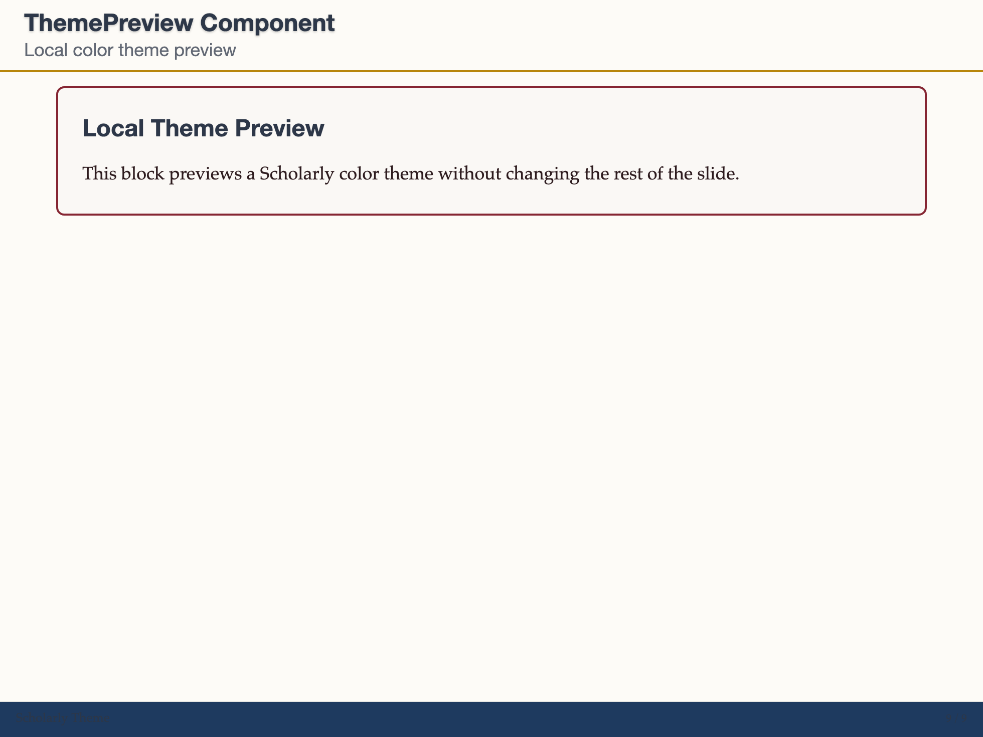
The ThemePreview component is a lightweight wrapper for previewing one of the Scholarly color themes inside a block. It sets a small set of CSS variables for the content inside the component only.
Basic Usage
markdown
<ThemePreview colorTheme="classic-blue">

## Preview Title

This content is rendered using the preview palette.

</ThemePreview>
Props
| Prop | Type | Default | Description |
|---|---|---|---|
colorTheme | string | 'classic-blue' | Color theme id: classic-blue, oxford-burgundy, cambridge-green, princeton-orange, yale-blue, nordic-blue, warm-sepia, monochrome, high-contrast |
Notes
ThemePreviewdoes not change your global theme; it only affects its own children.